Augusta health Covid-19 campaign
A CAMPAIGN THAT OUR LIVES DEPENDED ON: To help combat the COVID-19 pandemic and support the workers on the front lines, a cross-channel campaign spanning from March 2020 to present day was deployed. The following videos are examples of content created in support of this campaign. Additionally, we created a monthly newsletter, social media content, billboards, and print ads. What started as a plea to stay home, or to wear a mask, crescendoed into a plea to vaccinate, to honor the exhausted healthcare workers, and together to end the pandemic.
Shown here are four more recent videos that aired on local television and social media channels. My role was creative direction, asset creation or pulling from stock, editing, motion graphics, and special effects.
AWARDS: ASTER Judge’s Choice Award (1 of 4 international awards given), SIA Gold for Video Series, and Gold for Campaign.
AUGUSTA HEALTH REBRAND
PUTTING PEOPLE AT THE CENTER: Augusta Health had outgrown its logo which had symbolized the unity of two disparate community hospitals. Aligning the new identity around the brand promise of “putting people at the center of everything we do” resulted in a simple logo with a humanoid shape with outstretched arms in the “A” of Augusta. The human in the “A” occupying the negative space is a simple visual representation of the boundless capacity for care that Augusta Health caregivers provide. The logo was colorized in shades drawing from the natural surroundings of our home in the Shenandoah Valley, strengthening the unique position a community hospital holds in its service area. An innovative approach to color that recognizes both our existence in a digital age and the 24 hour care provided by Augusta Health sees the logo expressed in two colorways: light mode and dark mode.
AWARDS: SIA Gold Medal
Mary Baldwin University residential undergraduate campaign
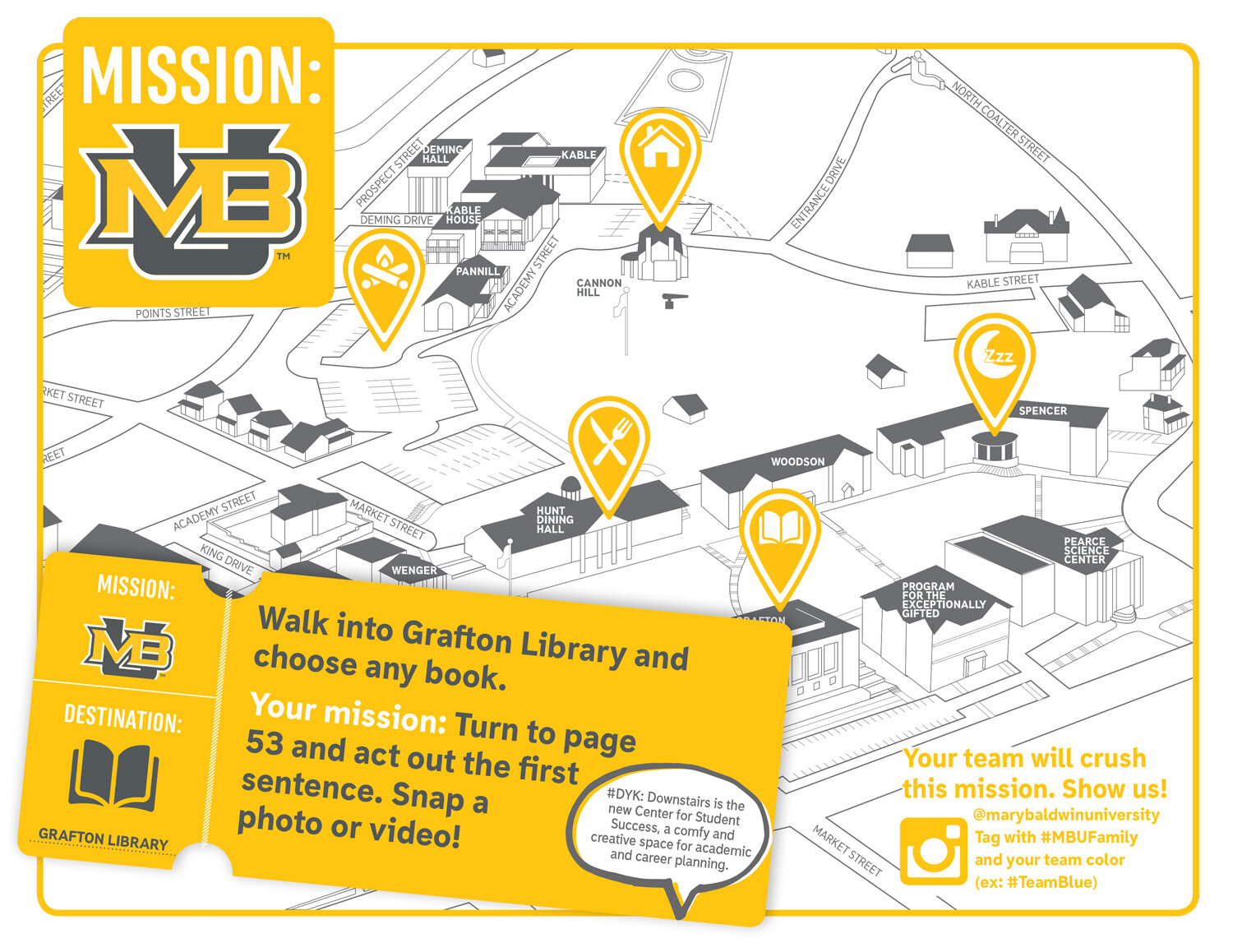
When enrollment plummeted by 46% from one year to the next, the communications team had a Herculean task ahead of them: to recruit 300 undergraduate residential students to keep the university solvent. In sixteen working days, we created the viewbook that would be the foundational document for the campaign. At break-neck pace, we built a robust campaign with everything from new recruitment fair materials and website to game-ifying the campus visit experience, and rebuilt a crumbling brand. What resulted? An incoming class of 428 students, the highest in Mary Baldwin history. This year has continued to track with last year, with an incoming class of 451 students, a new record. Many things contributed to the success of this campaign, such as collaboration across our team and with admissions, a clear creative vision, charismatic design, and authentic storytelling.
VIEWBOOK

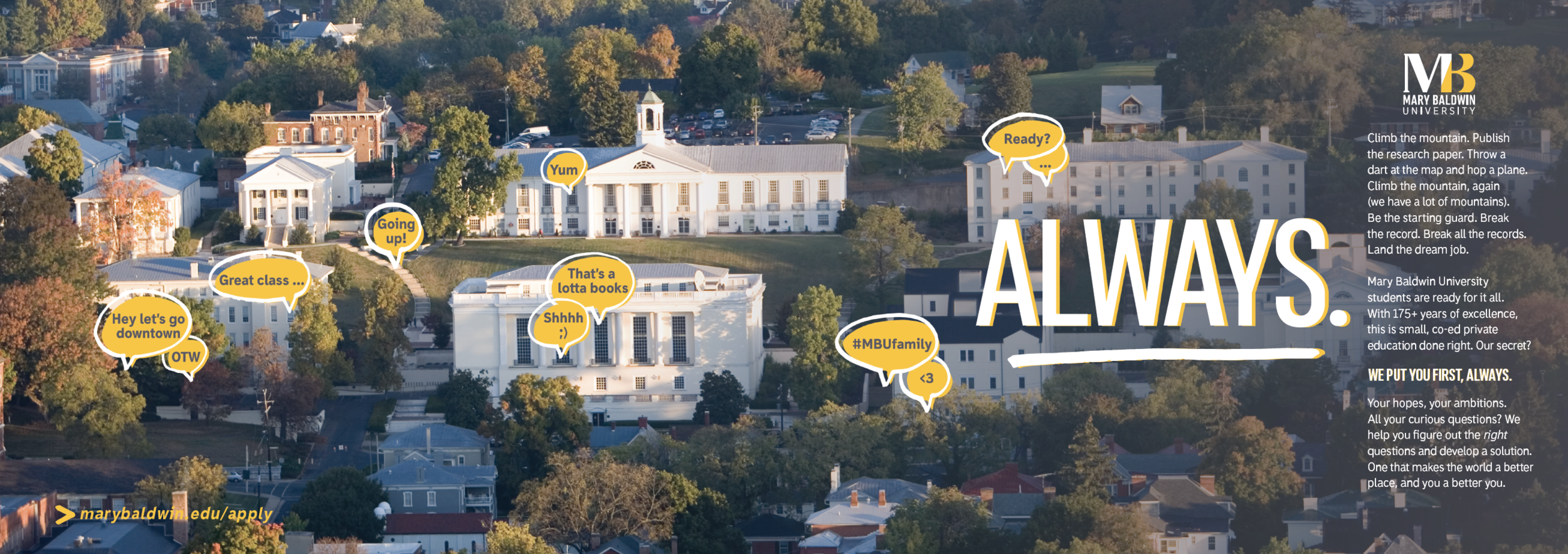

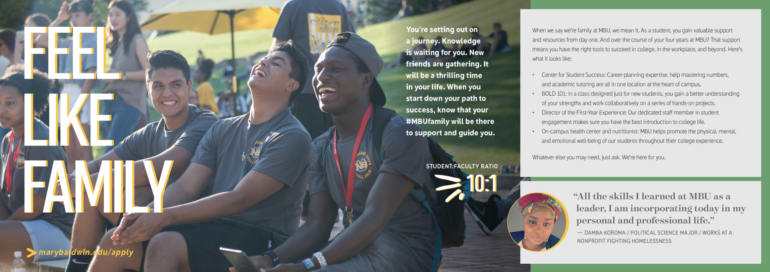
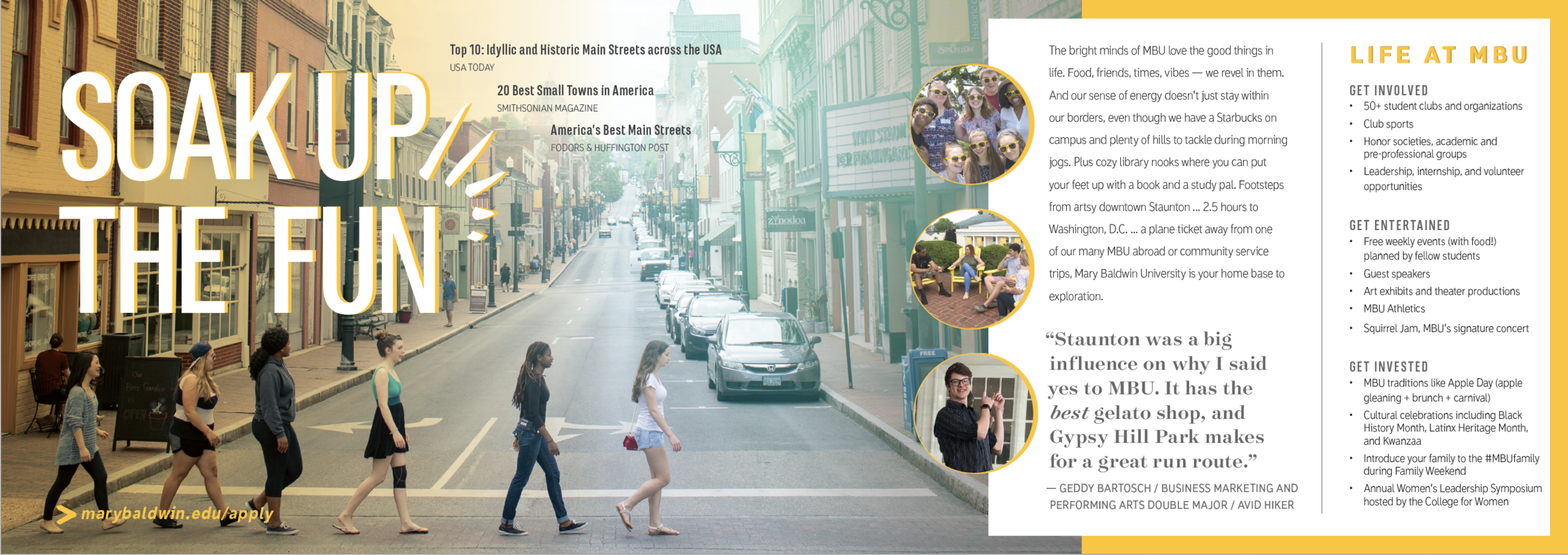


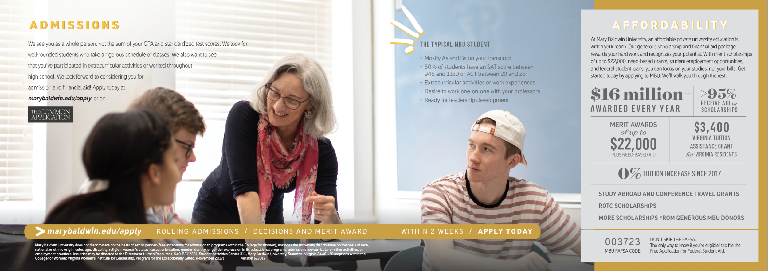


THE VIEWBOOK THAT COULD: This year we updated this book for its third and final recruitment season. The first iteration of it looked pretty similar, but we had to use some creative collage techniques and purchased stock photos where we didn’t have the content we needed to tell the story we knew was really there. This book was all about polishing the gems that Mary Baldwin already had: a beautiful hilly vista, a diverse community, and an intimate family-like vibe. It was absolutely incredible to see this book recruit students who then brought our vision for campus to life. This year we were finally able to replace a lot of the photos we didn’t love in the first edition, with photos we do.
AWARD: AMA EMMA Excellence in Campaign, 2019


